Core Web Vitals and Web Performance
What are Core Web Vitals?
Launched by Google in early 2020, Core Web Vitals provides unified guidance to help us deliver a great user experience. It also helps to focus on measuring performance from a user-experience perspective.
There are (currently) three metrics that focus on loading, interactivity, and visual stability.
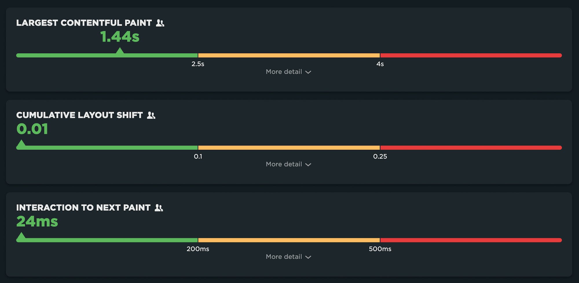
Largest Contentful Paint (LCP): measures loading performance. To provide a good user experience, LCP should occur within 2.5 seconds of when the page first starts loading.
Interaction to Next Paint (INP): measures interactivity. To provide a good user experience, pages should have a INP of 200 milliseconds or less.
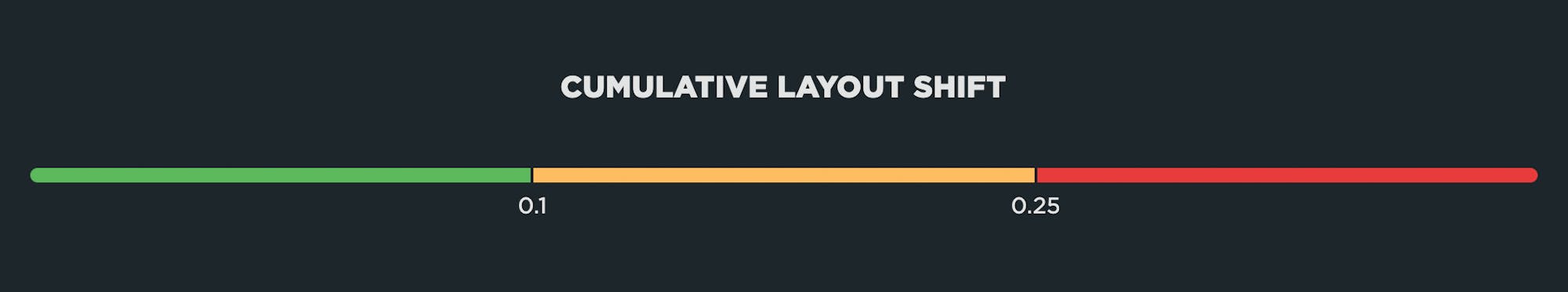
Cumulative Layout Shift (CLS): measures visual stability. To provide a good user experience, pages should maintain a CLS of 0.1. or less.
It’s important to make the distinction between Core Web Vitals and Web Vitals. Core Web Vitals focus on user experience metrics. They are a subset of Web Vitals – including Time to First Byte and Total Blocking Time – that serve as supplemental metrics for diagnosing specific performance issues.
Core Web Vitals and SEO
Core Web Vitals are among the page experience signals that Google factors into search ranking, alongside mobile-friendliness, security, and absence of intrusive interstitials. Since Web Vitals were announced, they’ve shot to the top of many people’s list of things to care about.
Don’t make pages faster solely for SEO purposes. You should make your pages faster because it makes your users happier and consumes less of their data, especially on mobile devices. Happier users spend more time on your site, are more likely to return, and are more likely to recommend your site to others.
Largest Contentful Paint (LCP)
Largest Contentful Paint measures when the largest visual element on the page renders. LCP is measurable with both synthetic and real user monitoring (RUM).

What makes LCP slower?
- Slow server response times
- Render-Blocking JavaScript and CSS
- Slow Resource Load Times
- Client-Side Rendering
How to measure and investigate LCP
Identify the Largest Contentful Paint element
To optimize the LCP metric and improve your website’s performance, you first need to pinpoint the specific element responsible for the Largest Contentful Paint.
You can do that using different performance tools, including PageSpeed Insights, Lighthouse, Chrome DevTools.
Optimize server response time
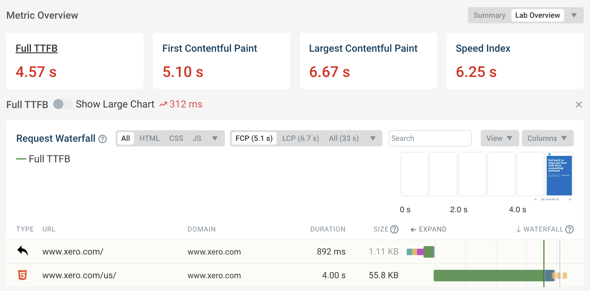
Loading a website always starts by loading an HTML document. Before the browser starts downloading the document no content can be displayed.
You can check if server response time is an issue by looking at the Time to First Byte (TTFB) metric. The TTFB should be below 800 milliseconds. Use the free DebugBear website speed test to test your TTFB.
Reduce render-blocking resources
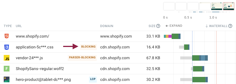
Render-blocking resources prevent all page content from rendering. Finishing these critical requests therefore puts a lower bound on when your largest content element can appear.
Tools like Lighthouse can tell you what requests on your page block rendering.
Optimize LCP images
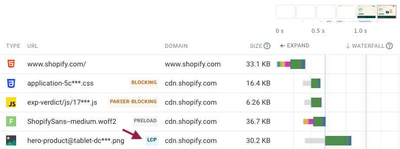
Large hero images, while visually impactful, are often the culprits behind poor Largest Contentful Paint scores. In this case you need to find find out what the image URL is and how you can make that network request finish faster. In DebugBear the LCP image is highlighted in the request waterfall with an LCP badge.
How can you make the image load faster?
Image compression: a smaller image file will take less time to load than a large one. Use modern formats like WebP and AVIF to speed up the largest image.
Shorten request chains: check the request initiator to see if the image is referenced in the body HTML of the document. If it isn’t then you can move on to investigating how to speed up the resource that does initiate the LCP image request
Avoid new server connections: if you load the document from example.com and the LCP image from image-cdn.com then the browser will need to establish a server connection to the other server before starting the image download. If a server connection is reused then this is not necessary, typically saving three round trips on the network.
Preload the LCP image: Preloading a resource not only helps the browser discover it sooner but also prioritizes downloading it.
Consider using responsive images
Responsive images let you load appropriately sized images for the context where the image elements appear.
For example, on a mobile device with a low-resolution screen you might only need a small image. Loading small images saves bandwidth and means that the image files will download more quickly.
In contrast, on a high-resolution desktop screen you might need to load a larger image to deliver the best visual results to visitors.
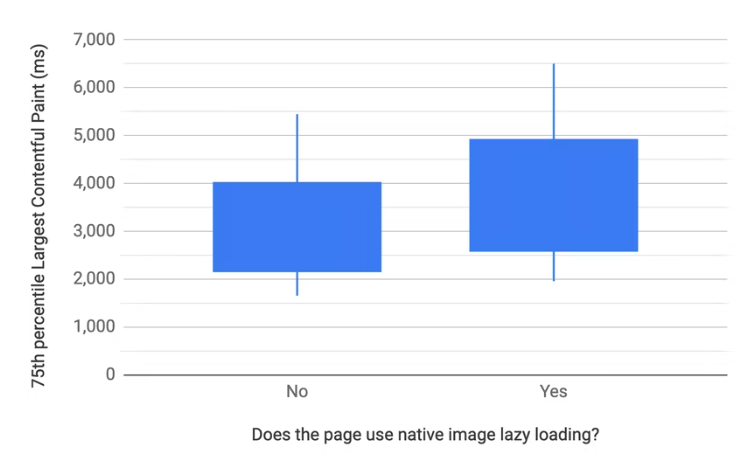
Don’t lazy load the LCP image
Lazy loading can speed up your website by focusing bandwidth on high-priority resources. However, when used on LCP elements it can actually make your site slower, as these images should be loaded with a high priority.
Google found that websites with image lazy loading enabled tends to have a higher LCP. So be careful not to use loading="lazy" incorrectly.
Prioritize the LCP image
Even if you’re not lazy loading the LCP image, the browser still assumes that most images on a page are low priority. For example, they might only appear below the fold or in the page footer.
The browser cannot identify important above-the-fold images until after the initial render of the page, when all relevant styles have been loaded. Therefore a low resource priority is assigned initially until after the First Contentful Paint when the page layout is known.
To learn more about optimizing LCP: https://web.dev/articles/optimize-lcp
Interaction to Next Paint (INP)
Interaction to next paint is a responsiveness metric that replaces First Input Delay as a Core Web Vital. Like it’s predecessor, INP measures real user interactions and can only be measured with RUM tools.

A few technicalities about INP that you may care about:
The user input required for INP is defined as a click/tap or key press. It doesn’t include scroll or zoom.
INP can be measured in traditional applications as well as SPAs.
INP uses the Event Timing API which is supported in Chrome and Firefox (not available for Safari)
What makes INP slower?
Long-running JavaScript event handlers
Input delay due to Long Tasks blocking the main thread
Poorly performing JavaScript frameworks
Page complexity leading to presentation delay
Like FID, input delay can happen when the browser’s main thread is too busy to respond to the user. Most commonly, this is due to the browser being busy parsing and executing large JavaScript files. There’s a lot of unnecessary JS on many pages, and JS files have gotten bigger over the years. The more JS on your page, the more potential for slow INP times.
Steps in Measuring INP
Capturing user interaction: The measurement begins the moment a user interacts with the page. This interaction could be a click, a tap on a touchscreen, or a keypress on the keyboard. INP focuses on these specific types of interactions, as they are direct and intentional actions requiring a response from the page.
Input delay: The next phase in the measurement is the input delay. This is the time taken before the page starts processing the interaction. During this phase, the browser might be busy with other tasks, which can delay processing of the user’s input.
Processing time: Once the input is being processed, the next phase is the processing time. This involves running the event handlers associated with the interaction. These event handlers are typically JavaScript functions that execute in response to the user’s action. The processing time can vary depending on the complexity of the tasks these handlers perform.
Presentation delay: The next phase is the presentation delay after processing the input. This is the time taken for the page to render the visual response to the interaction. It includes tasks like recalculating the layout of the page, executing any CSS changes, and repainting the page content to reflect the interaction.
Visual update: The final step is the visual update on the page, which is the culmination of the interaction process. This is when the user sees the result of their action, such as a menu opening, a form submission indication, or any other visual change on the page.
Calculating INP: The total INP is calculated by adding the input delay, processing time, and presentation delay. This gives a comprehensive measure of the time from the user’s initial interaction to the next paint, which reflects the visual update on the page.
Tools to Measure INP
INP can only be measured with field tools as it requires real user interaction data. These tools include:
PageSpeed Insights: Provides a user-friendly interface to view INP scores. PageSpeed Insights provides the 75th percentile score for the last 28 days.
Google BigQuery (CrUX Dashboard): Offers a more historical context of INP scores. Google measures all interactions real Chrome users have with a page and stores them in the CrUX dataset.
Lighthouse Tool: Useful for debugging INP in real-time during development.
Core Web Vitals Visualizer: Helps visualize INP and other metrics.
Optimize Interaction to Next Paint
1. Minimize CPU Processing on Your
Asynchronous code execution: Run more of your code asynchronously to ensure that the user gets an immediate UI update, even if some background processing is still ongoing.
Profile website code: Use tools such as the DevTools performance profiler to understand what’s happening on the main thread and identify areas for optimization.
Review third-party scripts: Assess if third-party scripts are impacting your site’s responsiveness and configure or defer them as necessary.
2. Reduce Input Delay
Break up main thread tasks: Reduce and break up background CPU activity on the main thread to minimize input delay.
Total Blocking Time (TBT) metric: Use this metric in lab data to identify background activities that could be blocking user interactions.
Optimize third-party code: If third-party scripts are causing delays, explore options to reduce their impact or load them only when necessary.
3. Optimize Processing
Efficient code execution: Investigate where the browser spends most of its time and optimize those parts of your application.
Avoid unnecessary renders: In frameworks such as React, ensure that components are not rendering unnecessarily.
Layout work reduction: If a significant amount of CPU activity is the result of layout work, find ways to reduce layouts and repaints.
4. Update UI Before Heavy Processing
Immediate feedback: Provide visual feedback (like a spinner) before starting CPU-intensive tasks.
Use web workers: For heavy JavaScript processing, consider using web workers to run tasks off the main thread.
5. Avoid Blocking Dialogs
- Non-blocking UI elements: Replace native alert, confirm, and prompt dialogs, which block the main thread, with non-blocking UI elements.
6. Reduce Presentation Delay
Simplify page updates: If rendering page content is slow, focus on showing important content first to deliver the next frame more quickly.
Manage queued interactions: Be aware of how queued interactions can add to the presentation delay and manage them efficiently.
Cumulative Layout Shift (CLS)
Cumulative Layout Shift measures the visual stability of a page. The human-friendly definition is that CLS helps you understand how likely a page is to deliver a janky, unpleasant experience to viewers.
CLS is a formula-based metric that takes into account how much a page’s visual content shifts within the viewport, combined with the distance that those visual elements shifted. CLS can be measured with both synthetic and RUM.
What makes CLS worse?
One of the benefits of Cumulative Layout Shift is that it makes us think outside of the usual time-based metrics, and instead gets us thinking about the other subtle ways that unoptimized page elements can degrade the user experience.
CLS is strongly affected by the number of resources on the page, and by how and when those resources are served. If your CLS score is poor, some of the biggest culprits are:
Web fonts – There can be a significant discrepancy between the sizes of the default and custom fonts, which creates layout shifts. While it’s good practise to not hide your content while waiting for a web font to load, it can negatively impact your CLS score if the web font then moves an element when it renders.
Opacity changes – CLS doesn’t take into account opacity changes, so adding an element with opacity 0 and then moving it will affect your CLS score.
Ads – They can cause the entire editorial body of the page to shift. The size of the shifting element really matters when it comes to calculating CLS.
Carousels – A surprising number of carousels use non-composited animations that can contribute to CLS issues. On pages with autoplaying carousels, this has the potential to cause infinite layout shifts.
Infinite scroll – Some implementations can cause layout shifts.
Images – Slow-loading images (e.g. large images or images on slow connections) can cause shifts if they load after the rest of the page has already rendered.
Banners and other notices – These can cause other page elements to shift if they render after the rest of the page.
Optimizing Cumulative Layout Shift (CLS)
After collecting the metrics data and understanding the problem, we can start with actual performance optimization and reduce the CLS. We should improve the most important elements/pages on the website first and track how the improvements affect the score.
Add Size Attributes to Images and Video
Size attributes are the low-hanging fruit of CLS optimization. Always include width and height size attributes on your images and video elements to ensure sufficient space is allocated on the page before the browser started fetching them.
<img src="example.jpg" width="360" height="180" alt="example">Content dynamically injected with JavaScript
Dynamically injected content refers to the DOM elements that get added dynamically above existing content. These can be banners, ads with dynamic sizing, cookie consent popups, iframes, widgets that dynamically resize (like chat windows) or any kind of content inserted after the initial page load.
Possible Solutions
Avoid using JavaScript to style or generate content wherever possible.
Overlay small dynamic content, e.g. with absolute positioning properties, to cover the existing elements instead of shifting them.
For larger elements, reserve space on the page in advance - for example, show them out of the main content flow (in the sidebar) or use the skeleton/placeholder strategy.
If possible, add dimensions to iframes and other elements with dynamic content.
Optimize loading strategy for late-discovered scripts that populate components with content. Defer the scripts used to add elements above the fold that will likely cause layout shift.
Use the 500ms Window for User Interaction
Load more and Infinite scroll are just two examples of interaction patterns where the response time should be kept under the 500ms Input exclusion window. Otherwise, as the page content gets shifted by the dynamically injected content (the footer in this particular case), the shifts will increase the CLS score. Prefetch the content to load it fast and use placeholders/skeleton while the data is being requested. Read about the possible solutions in Addy Osmani’s article - Infinite Scroll Without Layout Shifts.
Enforce Scrollbar Appearance
Some OS (like Windows) use non-overlay scrollbars. These scrollbars are added after the First Paint, during the page load and can cause page content to shift e.g. when injecting additional content with JavaScript. You can add the following rule to force the scrollbar appearance:
html { overflow-y: scroll }This should force the scrollbar to show all the time, preventing horizontal layout shift. When not needed, the scrollbar will be grayed out but will keep its width. Note: You should consider this technique only on pages that require this fix to reduce the CLS.
Font Loading and Text Rendering Strategy
Common reasons for layout shifts are the shifting of text elements. Upon load completion, the fallback font is replaced with the web font and as a result, the text is re-rendered with the intended font. Web font loading often causes misalignment of layout elements, e.g., if text rendered with the fallback font is one line shorter than the one rendered with the web font.
This can be avoided by defining a different text rendering strategy with the CSS descriptor font-display. For example setting the font-display to optional within an at-rule means that: if the primary font does not load in the first 100ms, the text is rendered using the fallback font. However, the next time you visit the page the web font will be used if loaded successfully. This strategy allows us to minimize repaints and CLS.
We can combine font-display: optional with <link rel="preload"> to preload optional fonts and completely eliminate layout shifting. Read more about it in the Preload Optional Fonts article on web.dev.
If you prefer font-display: swap or any other value except optional, try using some of the font style matching tools like Font Style Matcher or check this list - Metric Compatible Fonts. You can minimize the discrepancy between the fonts by choosing ones with similar x-heights and widths.
Conclusion
Working on web performance is so well aligned with other worthy goals. A fast is site more accessible to other people. A fast site tends to convert better. Using web standards and more native web technologies tends to lead to a faster site.